The Danish Girl - Gender As a Performance

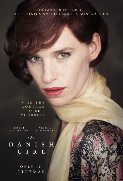
The Danish Girl is a study of gender and femininity, beautifully filmed on opulent, painterly backdrops. Moreover, one of the heroines is Gerda Wegener, a name I came across during my research on women's magazines from early 20th-century.
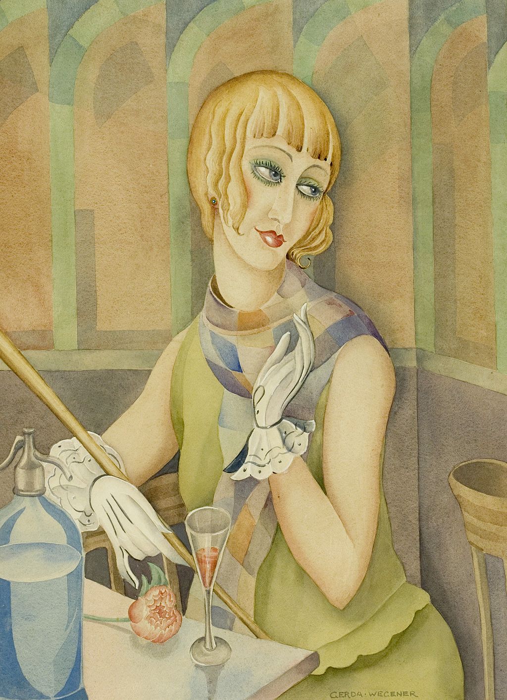
Gerda Gottlieb, Lili Elbe, 1920. wikipedia.org

Gerda Gottlieb, Lili Elbe, 1920. wikipedia.org

The film tells the tragic story of Einar Wegener, a transgender artist, who underwent one of the first gender reassignment surgeries in 1930, to become Lili Elbe. He was married to Gerda Wegener, a distinguished Danish painter and fashion illustrator. Initially, Gerda aided her husband and contributed to the formation of the alter persona Lili. She dressed him in women's clothes and he served as a model in her paintings. 

The work of Gerda Wegener has a prominent place among the art deco artists of the era. She explored gender as a performance (The Guardian 2015) and depicted long-legged, confident and active women. These artworks fascinated the Parisian art society. However, people were scandalised to learn that the model behind some of the portraits is Gerda's husband.

Neither medicine nor society was equipped to meet Einar's transformation. He suffered depression, his marriage to Gerda was dissolved, and he died as a result of his surgeries. It is interesting that Lili Elbe was ever only free to express her femininity in Gerda's paintings. In this respect art is often more forward than society.

Previously, I discussed Berger and how the "male gaze" is challenged by contemporary artists. It appears that Gerda Wegener, with her erotic paintings, redefined the "female gaze". Historian Andrea Rygg Karberg states that Gerda's work has revolutionised how women are portrayed in art:

Women were typically seen through the male gaze. But Gerda changed all that because she painted strong, beautiful women with admiration and identification – as conscious subjects rather than objects.
— Andrea Rygg Karberg, 2015. www.theguardian.com
Gerda Wegener, A Summer Day, 1927. www.theguardian.com

Gerda Wegener, A Summer Day, 1927. www.theguardian.com

Nature Of Motherhood Revised

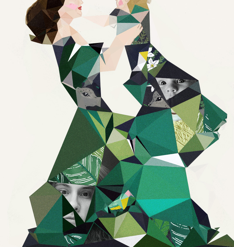
In recent posts, I examined fragmented femininity and Delaunay triangulation. I was inspired by the work of Anna Kövecses, who combines photography with hand drawings. I became curious how the narrative and style of my existing illustrations would change if I use fragmentation and photo collage. I applied Delaunay Triangulation to the illustration The Nature Of Motherhood and incorporated photos of me and my daughter Emma. The artwork has a personal, intimate feeling. The geometry adds an abstract quality to the picture and the message of "motherhood" is encoded in the maze of elements. The photographed gazes survey back the viewer. It is an interesting transformation of my style.

Fragmented Femininity

In contemporary Illustration textbooks, the depiction of fragmented gender and femininity is often discussed as a trend (Wigan, 2006, p. 36). On the other hand, according to researchers like Gauntlett perception of self-identity is unified (Gauntlett 2008, p. 266). He challenges the postmodernist views of identities being fragmented, and he shows that in visual representation, most people portray their identity as “one thing” (Gauntlett 2008, p. 269). I set to find some examples of fragmented feminine depiction.

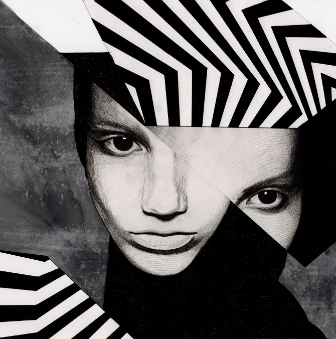
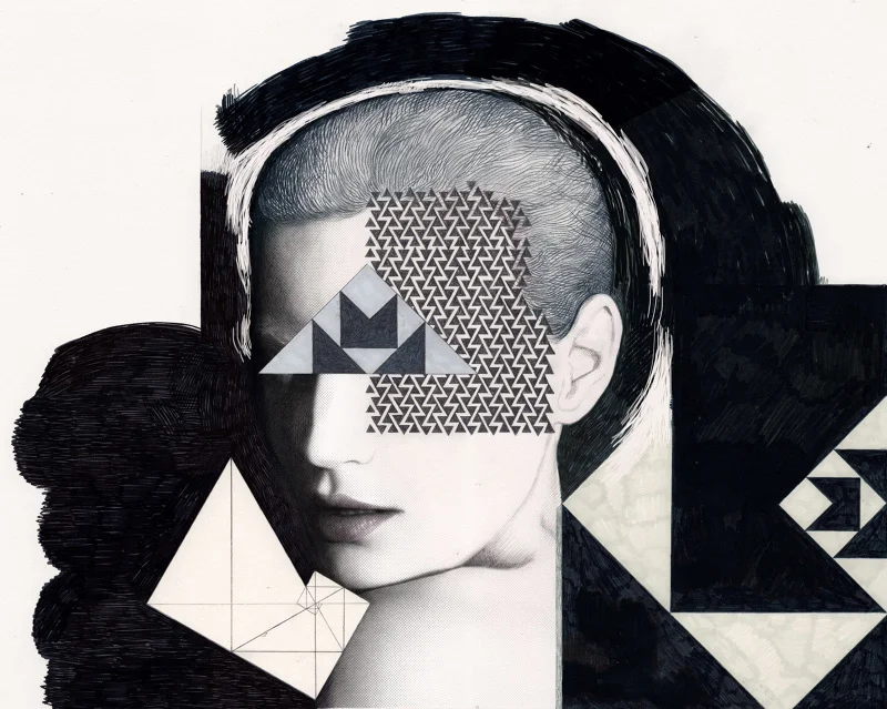
First, I examined the work of Anna Higgie. She creates illustrations of womanly forms interrupted by geometric shapes and graphic patterns. Higgie combines traditional medium like ink, pencil, watercolour, with digital techniques. I was drawn by the cinematic mood, the monochromatic palette and the juxtaposition of fine art drawings with abstract geometric elements. It creates a feeling of feminine vulnerability, hidden behind the digital patterns. These pictures can be viewed as portraits of the modern woman and her fragmented life experiences, of which feminist authors like June Hannam write.

Anna Higgie, Dolor EP, 2012. www.annahiggie.co.uk

Anna Higgie, Dolor EP, 2012. www.annahiggie.co.uk

Anna Higgie, Designs for murals in rooms 103 & 104 of ACE London, 2013. www.annahiggie.co.uk

Anna Higgie, Designs for murals in rooms 103 & 104 of ACE London, 2013. www.annahiggie.co.uk

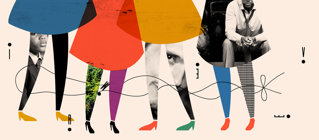
Next, I explored the work of Hungarian designer Anna Kövecses. I was fascinated with the playful way she combines photos with illustrations. This technique enhances the narrative by adding a layer of additional meaning in the composition. Her work has a deceptively naive style, featuring simple figures and bright colors. However, the layouts are carefully arranged in a knowledgeable and thoughtful manner. In my personal work, I usually draw a clear distinction between my design works and my illustrations. Merging the two disciplines can lead to interesting results, as these images by Kovecses show. 

Unlike the examples above, my works represent things in a realistic manner. I would like to experiment more with interrupting the flow by use of geometry or photo collage.

Anna Kovecses, Aritzia, 2013. www.behance.net/annakovecses

Anna Kovecses, Aritzia, 2013. www.behance.net/annakovecses

References

Gauntlett, D. 2008, Media, gender and identity: an introduction, New;1;2; edn, Routledge, London.

Wigan, M. 2006, Thinking visually, AVA, Lausanne.

Tate Modern Museum Visit

My visit to Tate Modern was a journey in art history. Two artworks inspired me significantly - the Marilyn Diptych by Andy Warhol and the Weeping Woman by Pablo Picasso.

Andy Warhol, Marilyn Diptych, 1962. Tate Modern Museum. Photo by Sabina Radeva 2015.

Pablo Picasso, Weeping Woman, 1937. Tate Modern Museum. Photo by Sabina Radeva 2015.

Pablo Picasso, Weeping Woman, 1937. Tate Modern Museum. Photo by Sabina Radeva 2015.

Andy Warhol created the  Marilyn Diptych few years after Marilyn Monroe died in 1962 (Marilyn Diptych 1962, Caption). This Pop Art piece is assembled from numerous silk screen paintings. It is a dual composition representing on one side Marilyn's popularity and wide exposure (the repetitive color images) and on the other side her mortality (the black and white fading images). Traditionally the diptych format has been used in early Christian icons (Wikipedia). It seems that Marilyn, a symbol of femininity and mass culture, is elevated virtually to a divine being in this artwork. Following this example, I would like to find out in the future, how the use of various formats can affect the meaning of my illustrations.

Picasso represents the School of Paris and early modernism. He invented Cubism with Braque in 1907 and also exhibited with Surrealists (Alley 1981). The Weeping Woman is an emotional piece. It is a colorful oil painting, created in protest of the bombing of Guernica. The vivid color palette, a mixture of bright colors and dark hues, conveys the painful emotion. I admire the skilful way Picasso balanced the color proportions to tip the feeling toward violent and sad, despite the joyful yellow background and fresh, feminine turquoise shades on the skin of the woman. What appealed to me in this painting is the pictorial flatness and the fragmented style of the artwork.

What is similar between the two works above, and what attracted my attention, is the effective use of color to communicate emotion and the way they utilize feminine iconology (the celebrity Marilyn Monroe in the former, and the symbol of the mother in the latter).

References

Alley R., Catalogue of the Tate Gallery's Collection of Modern Art other than Works by British Artists, Tate Gallery and Sotheby Parke-Bernet, London 1981, pp.591-2

Nature of Motherhood Illustration Process

My research on the depiction of femininity has led me to various feminist texts, like the groundbreaking The Feminine Mystique by Betty Friedan (Friedan 1965). She used this term to describe the unhappy fate of women in the 1950s, who were pressured to assume the roles of homemakers as the ultimate fulfilment of their potential. Friedan discusses numerous illustrations in women's magazines, from early 20th-century, which idealise the motherly role. Recently I created an illustration for my practise, which depicts motherhood. Friedan's discourse prompted me to look with new eyes at this illustration. I think the feminine role is idealised to some degree here. However, the emphasis is on the emotional aspect of the mother-child connection, without limiting the female potential to that role alone.

Sabina Radeva, Nature Of Motherhood, 2015.

Sabina Radeva, Photos and sketches from the Botanical Garden, Oxford, 2015.

I was inspired by the works of Carmel Seymour and Simón Prades who create multiple stories within a scene, visual narratives which expand the boundaries of the canvas. The Botanical Garden in Oxford is one of my favourite places to visit and inspired me to incorporate flora and fauna elements. I imagined a conceptual illustration of a mother and child where their connection is represented by nature.

The clothes of the mother and child serve as a vignette to a botanical scene. The technique is not novel to me, as I have applied it in previous works of mine. However, here it is used more deliberately. The emotional, as well as biological connection between the mother and child, is communicated more clearly with the use of nature elements.

My work is detailed and decorative, influenced by Surrealism and Naturalism, similar to the works of Bosch, Teagan White, Carmel Seymour and John Buck. The visual language and style is now established, after several years of practise. However, I would like to try new techniques and transform my style.

References

Friedan, B. 1965, The feminine mystique, Penguin, London.

Eckhard Völcker - Photomicrography

I have been fascinated with the microscopic world since I received my first toy microscope as a child. During my biology studies in the university, I had the opportunity to work with high power microscopes and study microorganisms and tissues at a cellular level. My imagination was excited by the hidden universe that exists at 4x+ magnification. Fluorescent dyes are used to color tissues, resulting in defined shapes and patterns that can be seen under the compound microscope.

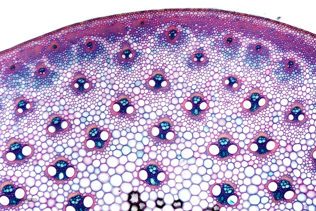
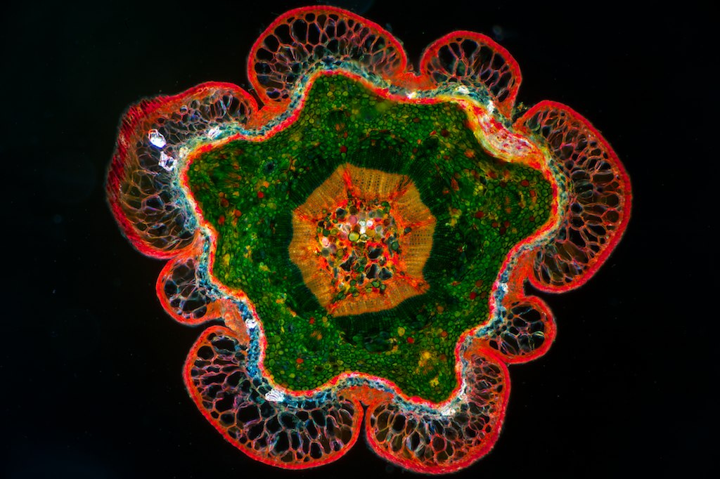
The Eckhard Völcker light microscope photography of plants is where art meets science. The captivating images feature brilliant colors and intricate mosaics of cells. They appear like fine wool knitted fabrics or organic mandalas.

I felt inspired to seek more ways to unite my former scientific education with my current creative work. I would like to create some nature inspired patterns of micro and macro structures.

Eckhard Völcker, 0016, 2012. www.flickr.com/photos/wunderkanone

Eckhard Völcker, 0016, 2012. www.flickr.com/photos/wunderkanone

Eckhard Völcker, Rose 10x, 2010. www.flickr.com/photos/wunderkanone

Eckhard Völcker, Rose 10x, 2010. www.flickr.com/photos/wunderkanone

Eckhard Völcker, 002 Bamboo, 2012. www.flickr.com/photos/wunderkanone

Eckhard Völcker, 002 Bamboo, 2012. www.flickr.com/photos/wunderkanone

Eckhard Völcker, Chesnut, 2012. www.flickr.com/photos/wunderkanone

Eckhard Völcker, Chesnut, 2012. www.flickr.com/photos/wunderkanone

Eckhard Völcker, Fir 5x, 2010. www.flickr.com/photos/wunderkanone

Eckhard Völcker, Fir 5x, 2010. www.flickr.com/photos/wunderkanone

Laura Callaghan Quotes

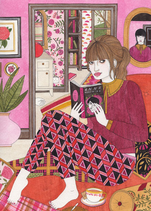
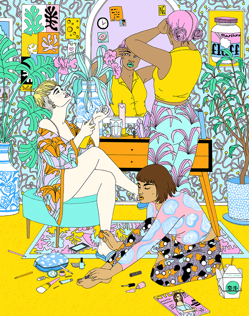
Laura Callaghan is a London-based illustrator. Her images caught my eye with the expressive use of patterns and color. She incorporates fashion and surface design influences in her work. Her characters are strong, sophisticated women, who love literature. I was intrigued by her process and researched more information about it. Below are excerpts from various interviews.

Laura Callaghan, The Pink Room. www.lauracallaghanillustration.com

Laura Callaghan, The Pink Room. www.lauracallaghanillustration.com

Laura Callaghan, for NYLON-magazine. www.lauracallaghanillustration.com

Laura Callaghan, for NYLON-magazine. www.lauracallaghanillustration.com

First, Laura approaches a brief or editorial comission by researching and collating reference images. She uses Pinterest to create her mood boards.

I’m not someone who draws out lots of thumbnails, I’m too impatient so usually dive straight in to sketching and figure out layout and composition by trial and error.
— Laura Callaghan, MagCulture, 2015.

I found this quote particularly relevant to my own practice where I rarely sketch or plan complete compositions. Usually, I draw various elements on paper separately and then I assemble them in Adobe Illustrator using a trial and error method and intuitive placement. 

Laura creates an authentic feel to her images by imagining a backstory.

My illustrations are very characters-based, so I always begin with an idea of who that person might be, their back story or mood - it keeps things interesting for me and I think it adds to the final atmosphere of a piece. I try to cram as many details as possible into an illustration: photographs, handwritten notes, hidden details and clues about the characters that occupy them. It makes the viewer look closely at the image and perhaps come up with a back story of their own.
— Laura Callaghan, www.thelesigh.com, 2013.

On the question, why she draws only women, she replies:

Women inspire me and I relate to women, so for me they make the most interesting subjects. When it comes to narrative work, the stories I want to tell are from a female perspective. I think ample space is given to male stories and characters within comics and illustration and I don’t really feel a need to contribute to that.
— Laura Callagan, thehundreds.com, 2015

 Callaghan keeps an active online presence and she often is contacted by art directors, who first noted her work online. 

Inspiration Carol Rossetti

In my search of contemporary illustrations that challenge the established views of femininity, I came across the work of Carol Rossetti.  Rossetti offers an empathic view on women's body and identity issues. She draws inspiration from a wide variety of stories and topics like  LGBTQ identity, body image, ageism, racism, sexism and ableism (Identities Mic 2014). The Women Project series struck a global attention with thousands of followers. A group of Israeli feminists translated the illustrations in Hebrew. 

Carol Rossetti, The Women project, 2014. www.carolrossetti.com.br

Carol Rossetti, The Women project, 2014. www.carolrossetti.com.br

Rossetti cleverly combines typography with simple pencil drawings to deliver these powerful messages. It is a goal of mine to incorporate more handwriting into my own illustrations, to enhance their content. I was impressed by the range of work Rosetti created, from light, humorous topics to dark themes like rape. Invariably she employs identical visual style in these works. I have always been interested in how the style of an image affects the meaning that is conveyed. To find illustrations that can elicit laugh or sorrow while using the same visual style is a revelation to me.

Inspiration Polly Nor

The concept of the "male gaze" and "female gaze" was first discussed by British art critic John Berger in his essays Ways of Seeing (Berger 1972). Later feminist writer Laura Mulvey (Mulvey, 1975) reinforces this concept claiming that in cinema the camera gaze is “male” due to the male perspective of filmmakers. I wanted to find how contemporary artists challenge the male gaze and I came across the daring and humorous illustrations of Polly Nor.

London-based artist Polly Nor challenges the image of the objectified woman, created by pornography and intended for male pleasure. In her interview for Dazed magazine (Dazed 2015), she states:

“I am questioning the ubiquitous male vision (of women),” she tells us, offering instead an “alternative view on sexuality, relationships and emotions from a modern-day female perspective.” - Polly Nor, Dazed 2015
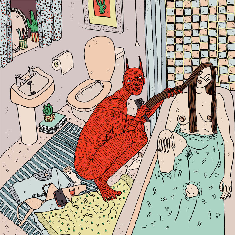
Polly Nor, Babe You Are Going To Be Fine, 2015. www.pollynor.com

Polly Nor, Babe You Are Going To Be Fine, 2015. www.pollynor.com

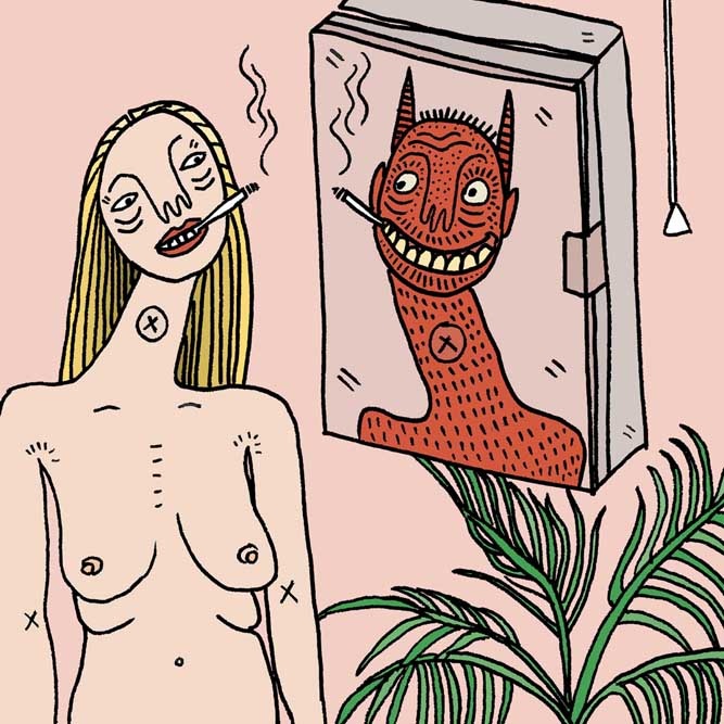
Polly Nor, Trust Nobody, 2015. www.pollynor.com

Polly Nor, Trust Nobody, 2015. www.pollynor.com

Nor is inspired by “funny texts, angry tweets, memes and selfies” (Dazed 2015). Most of her work is self-directed. Her process begins on paper, where she implements her visions into hand drawings and then she colours digitally in nude and pastel hues.

Sexuality is a common subject matter in her artwork, depicted in satirical and light tone. The devil creature in her images represents the dark side of her characters, Nor explains.

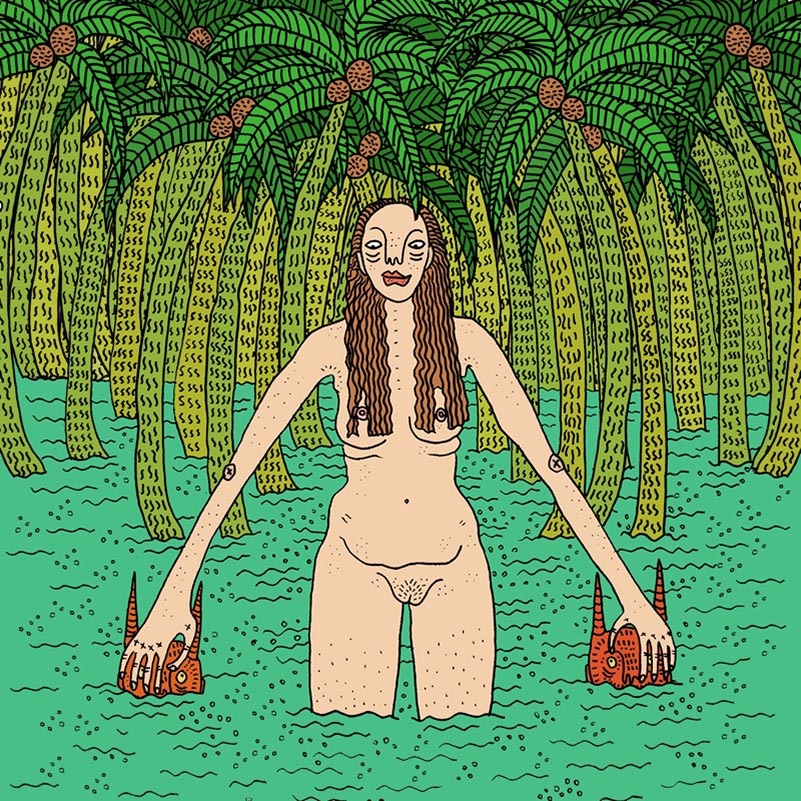
Nor's work differs from mine, both in the way she represents the feminine role and her bold, comic-like style of drawing. While I use botanical, floral elements to create idealised feminine compositions, Nor is not afraid to show the flaws of her characters in domestic scenes. Sometimes the characters escape into a wild, tropical world which signifies the inner savage feminine desire.

Polly Nor, It Never Happened, 2015. www.pollynor.com

Polly Nor, It Never Happened, 2015. www.pollynor.com

References

Berger, J. 1972, Ways of seeing, Penguin, London.

Mulvey, L. 1975, Visual pleasure and narrative cinema, Screen, vol. 16, no. 3, pp. 6-18.

Automatic Drawing

My recent post on automatic drawing prompted some experiments on my own. Automatism was practised by surrealists like Joan Miró, Salvador Dalí, Jean Arp and André Breton. The purpose of this technique is to evoke the creativity of the subconscious. My work is carefully planned and sometimes lacks spontaneity. Therefore automatic drawing can aid in breaking my routine and creating more expressive images.

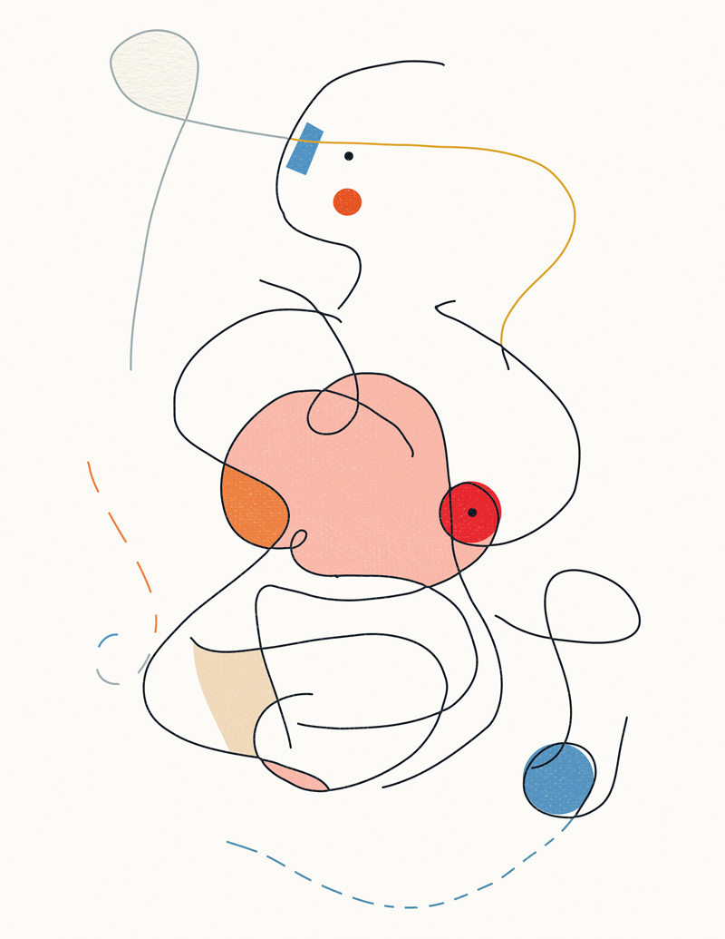
A state of trance is usually required before one can begin automatic drawing. I closed my eyes and spun several times. With closed eyes, I drew random lines on the paper. Then I scanned and processed the image. I could distinguish feminine forms in my drawing, which I colored digitally. There is a sensual aspect that could be an expression of my subconscious. However, it could also be an acquired meaning due to the many sexualized interpretations of automatic drawings which I observed previously.

Sabina Radeva, Automatic Drawing Sketch, 2015

Sabina Radeva, Automatic Drawing Processed, 2015.

Sabina Radeva, Automatic Drawing Processed, 2015.

Exploring the Surreal

Need some help getting to grips with Surrealism? The Doctor will see you now. Peter Capaldi, a former art student, and the latest actor to play Doctor Who, settles down on Freud's couch to deliver his wry take on the Surrealist movement.

Surrealism is a movement that has influenced my work significantly. Some of my favourite artists, since childhood, are Salvador Dalí and René Magritte. I wanted to learn more about Surrealism, and I found this wonderful video on the website of Tate Modern, in which the actor Peter Capaldi explain Surrealism in five minutes. I was inspired by the idea of automatic drawing, discussed in the video.

Automatism in Drawing

André Breton, the founder of Surrealism, released the Manifesto of Surrealism in 1924, where he equates it with automatism: "psychic automatism in its pure state" based on the "actual functioning of thought ... in the absence of any control exercised by reason," (Conley 2006). 

Automatic drawing was practised by artists like André Masson, Joan Miró, Dalí, Jean Arp, André Breton and Picasso. The main purpose of this technique is to induce dream-like state, where the subconscious can be expressed. The hand is allowed to move "randomly across the paper" and is freed of rational control (Wikipedia 2015). Dreams, the main tools used by Surrealists, have the qualities which Freud described as essential in unlocking the subconscious: "the inexhaustible richness of spontaneous associations, and the ability to transform conventional reality into fantastic reality. This was a creativity known as automatism." (Vesly 2011)

Recently, I started experimenting with Generative art and was excited to find that it is a form of automatism. I would like to attempt automatic drawing and find ways to create more spontaneous and expressive work. 

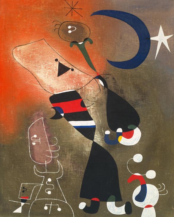
Joan Miró Women and Bird in the Moonlight 1949. http://www.tate.org.uk/

Joan Miró Women and Bird in the Moonlight 1949. http://www.tate.org.uk/

References

Conley, K. 2006, "Surrealism and Outsider Art: From the "Automatic Message" to André Breton's Collection", Yale French Studies, vol. 109, no. 109, pp. 129-143.

Veselý, D. 2011, "Surrealism and Latent World of Creativity", Umeni, vol. 59, no. 3-4, pp. 267-273.

Body Art - Illustration Process


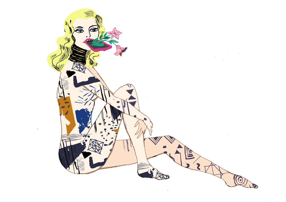
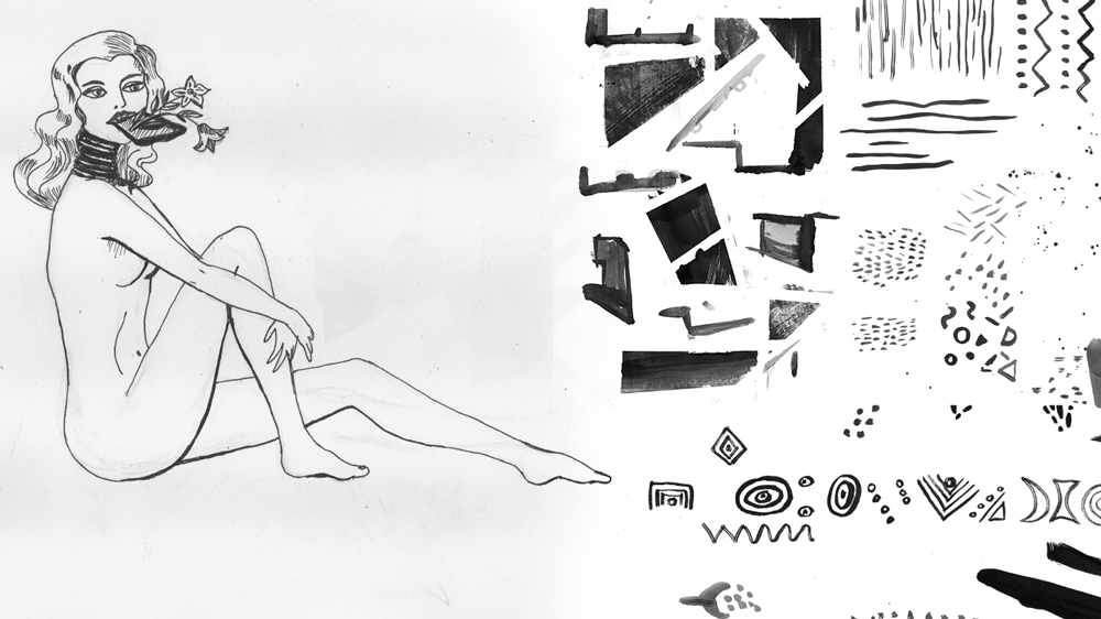
The illustration below is my response to the body art and modification research I did recently. I was influenced by the tribal lip-plugs and neck extenders, that I saw in Pitt Rivers museum. Further, the concept of the female body as a canvas, in addition to being represented in art, is fascinating to me. The figure of the woman in my drawing is inspired by Rolf Armstrong's paintings. His glamour girls from the 20s are synonymous with the American "Good Girl" art (American Art Archives). I imagined how such pinup girl would look with body modifications typical of an African tribe. As discussed previously, such modifications may seem extreme to our Western culture, but are comparable to extreme plastic surgery, corset binding etc, found in our society. 

Sabina Radeva, Body Art & Modification, 2015.

Sabina Radeva, Body Art & Modification, 2015.

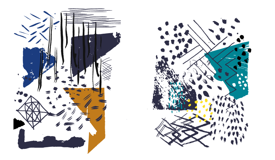
Further, I was inspired by the "Hand Marks" fashion and surface design trend and the work of Laura Slater. I painted ink lines, dots, geometric elements and mixed those with tribal art elements. This idea shares similarities to Terry Hays's fashionable tribal patterns. However, my patterns are less dense and are stylistically different. One could also trace my inspiration to the YASCO nudes covered with Henna designs. Unlike these, the final look of my illustration is rather close to Pop Art.

My influences and inspiration, documented previously in this blog, can be recognised in the language of the final artwork. However, the illustration feels distinctly mine and departs from any of the examples that I collected during the visual research. To that end, I am satisfied with the process and will use it further in other self-directed projects.

Sabina Radeva, Illustration Process - Sketches, 2015.

Sabina Radeva, Illustration Process - Sketches, 2015.

Pitt Rivers, Haida tribe lip-plugs. Photo by Sabina Radeva 2015

Pitt Rivers, Haida tribe lip-plugs. Photo by Sabina Radeva 2015

Sabina Radeva, Illustration Process - Patterns, 2015.

Sabina Radeva, Illustration Process - Patterns, 2015.

Inspired by Fashion - Hand Marks

I am often inspired by fashion and surface design. When I start a project, I usually add to my mood board several catwalk and textile images. Fashion designers find ways to innovate classic themes each year. I think we can learn how to innovate in design and illustration if we observe closely fashion trends.

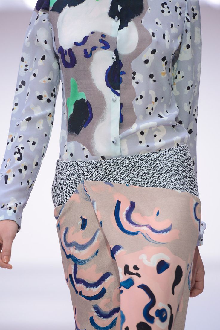
This year, one trend which caught my eye, reported by Pattern Bank, is "Hand Marks". It features "linear drawings, sketched texture, graphic lines, paint drips, abstract brush marks, felt tip marks and varied pen and pencil" (Pattern Bank 2015, p.31).

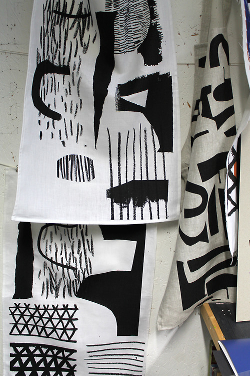
Laura Slater, Textiles, 2013. www.patternbooth.com

Laura Slater, Textiles, 2013. www.patternbooth.com

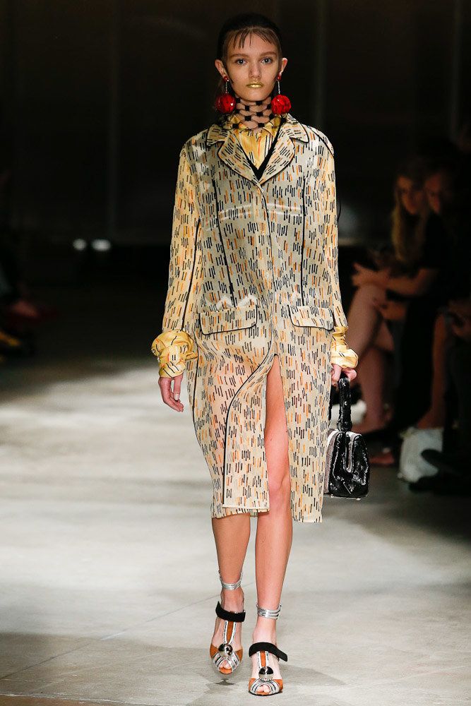
Prada, Spring 2016 Ready-to-Wear Collection Photos. Vogue.com

Prada, Spring 2016 Ready-to-Wear Collection Photos. Vogue.com

Michael van der Ham, Spring 2013 RTW. Vogue.com

Michael van der Ham, Spring 2013 RTW. Vogue.com

Georgiana Paraschiv, Graphic 81, 2015. www.behance.net/GeorgianaParaschiv

Georgiana Paraschiv, Graphic 81, 2015. www.behance.net/GeorgianaParaschiv

Christopher Kane, SS16, VOGUE.com 

Christopher Kane, SS16, VOGUE.com 

Chung-Im Kim, free grid. www.chungimkim.com

Chung-Im Kim, free grid. www.chungimkim.com

I was inspired by the textile designs of Laura Slater. Her influences are architecture and natural environment. Her ink markings on fabric are abstract and appear random; there is a great sense of rhythm and texture movement. Slater discusses her process "develops through photocopying, re-scaling, over drawing, and layering" (Laura Slater, 2014. www.heals.com).

The Hand Mark trend is also visible in the works of Georgiana Paraschiv. Her minimalist, brush mark patterns vary in scale through the layout. I found this technique interesting since I usually adhere to a particular scale for all elements in a composition.

From the catwalk, design labels like Prada, Kane and Michael van der Ham, showcase garments with ink lines, splatters and mixture of brush marks in various scale. 

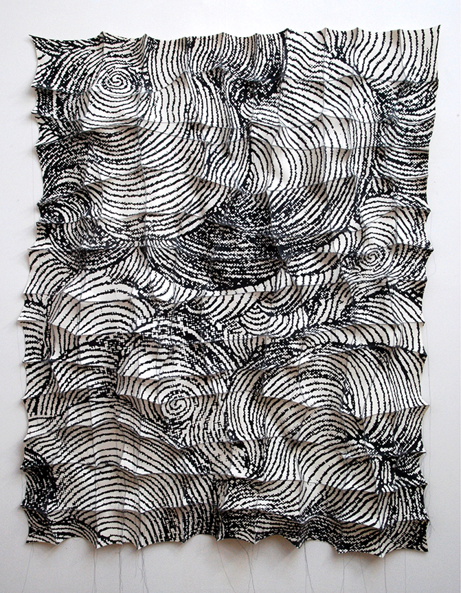
Via the Pattern Bank SS17 report, I also discovered the work of the textile artist Chung-Im Kim. She creates complex silk screen patterns on industrial felt pieces. By hand stitching the felt pieces together, the patterns are assembled and grow into organic complex wall structures.

Body Art and Modification

Recently I visited the Pitt Rivers museum in Oxford which contains a large selection of anthropological and archaeological artefacts. These objects are encased in Victorian glass boxes and are grouped by function.

The Body Art section made a strong impression on me (see images below). My area of focus is femininity in art and illustration. It is fascinating that the female body itself can serve as a canvas for art. Tattoos and body modifications can be an expression of personality, social status and cultural identity.  

Pitt Rivers Museum Oxford, Body Art. Photos by Sabina Radeva, 2015.

Some body modifications, like the Haida tribe lip-plugs (see image above) may seem extreme. However, there are parallels with our western society where extreme plastic surgery, tattoos, corset binding and piercing may seem equally bizarre. In an article by Reba Maybury, in Sang Bleu Magazine, the author discusses how current trends and social media influence people's perception of their body. There is an increasing number of body modifications where people imitate the look of famous celebrities to attract attention on platforms like Instagram. The more unnatural and extreme the body transformation, the more viral their online presence becomes.

Next, I was interested to find how contemporary artists have interpreted the theme body art. I mainly found works incorporating tattoos. There are not many illustrations on the topic of body modification.

Terry Hays combines street art with tribal tattoo motifs. He paints with acrylics on wood and creates beautiful patterns. I was inspired by the bold colors and intricate details. I would like to incorporate more patterns in my own work.

Terry Hays, Pembina Highway, 2012. www.terryhays.tumblr.com

YASCO, #39, 2009. www.onethousandandonedreams.com

YSCO, #7. www.onethousandandonedreams.com

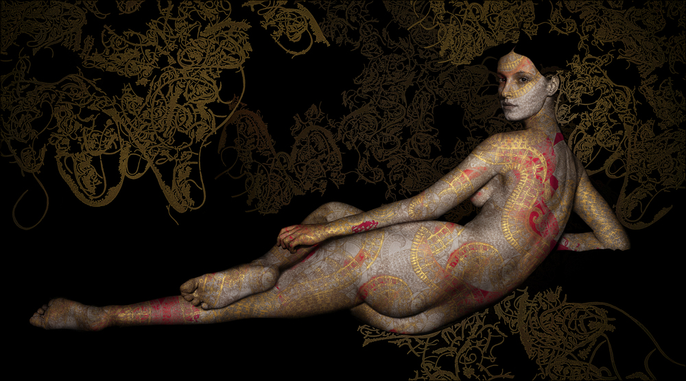
YASCO, Odalisque, 2011. www.onethousandandonedreams.com

YASCO, Odalisque, 2011. www.onethousandandonedreams.com

Stacia Burrington, Little Legs, 2012. stasiab.carbonmade.com

Stacia Burrington, Little Legs, 2012. stasiab.carbonmade.com

Artist Yasmina Alaoui combines Eastern, Arabic influences, Tattoo styles and Henna patterns to create mesmerising body art. Alaoui layers her motifs on black and white nude photographs. I liked the contemporary feel of the Henna patterns.

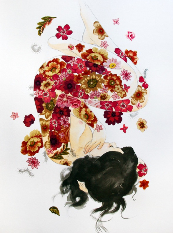
I examined the work of Stasia Burrington, who combines cut out fabric flowers with pencil drawings to create beautiful body art studies. I liked the Kraft blooms with vivid colors applied on the delicate, simple drawings.

I was inspired by the theme Body Art, and the works I found by contemporary artists. The images which I selected in this brief research share similarities to my work. I am attracted to intricate patterns and surreal compositions. I would like to respond to this theme with an illustration which also incorporates elements of body modifications.

Delaunay Triangulation Experiments

Following my reflections on Cubism (Picasso) and the fragmented femininity, I wanted to incorporate geometry in my illustrations. The main objective of trying new techniques is to make my artwork more spontaneous and transform it in unexpected ways.

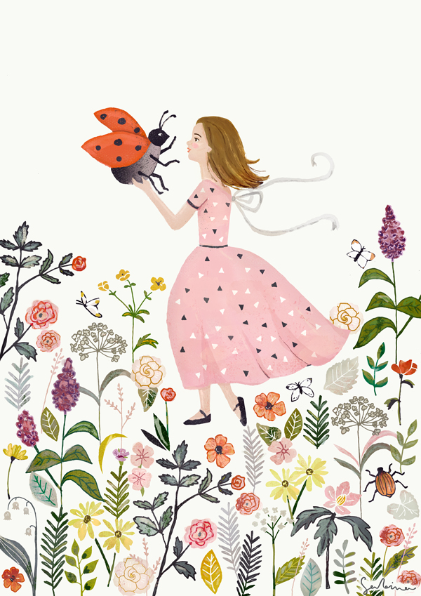
Recently, I found the work of Jonathan Puckey, who uses Delaunay Triangulation in Scriptographer to create fascinating abstract images. Scriptoghrapher is a plugin for Illustrator, which uses JavaScript language to create graphics. I applied Delaunay Triangulation to some of my existing artwork using a script by Jake Rathmanner and Dan Borufka. The minimalistic images, which resulted, are not typical for my style.

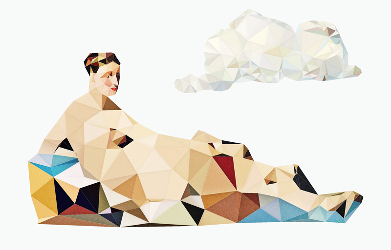
Triangulation of classic painting resulted in interesting compositions (see Surreal Odalisque below). I would like to continue these experiments and create surreal geometric scenes where I combine together various triangulated elements from different paintings and my own drawings.

Sabina Radeva, Lady Bug, 2015

Sabina Radeva, Lady Bug, 2015

Sabina Radeva, Lady Bug Triangulation, 2015.

Sabina Radeva, Triangulation Woman Portrait, 2015

Sabina Radeva, Triangulation Woman Portrait, 2015

Sabina Radeva, Surreal Odalisque, 2015

Sabina Radeva, Surreal Odalisque, 2015